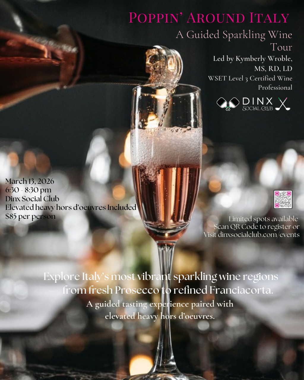
BeforeOriginal
Loading image...
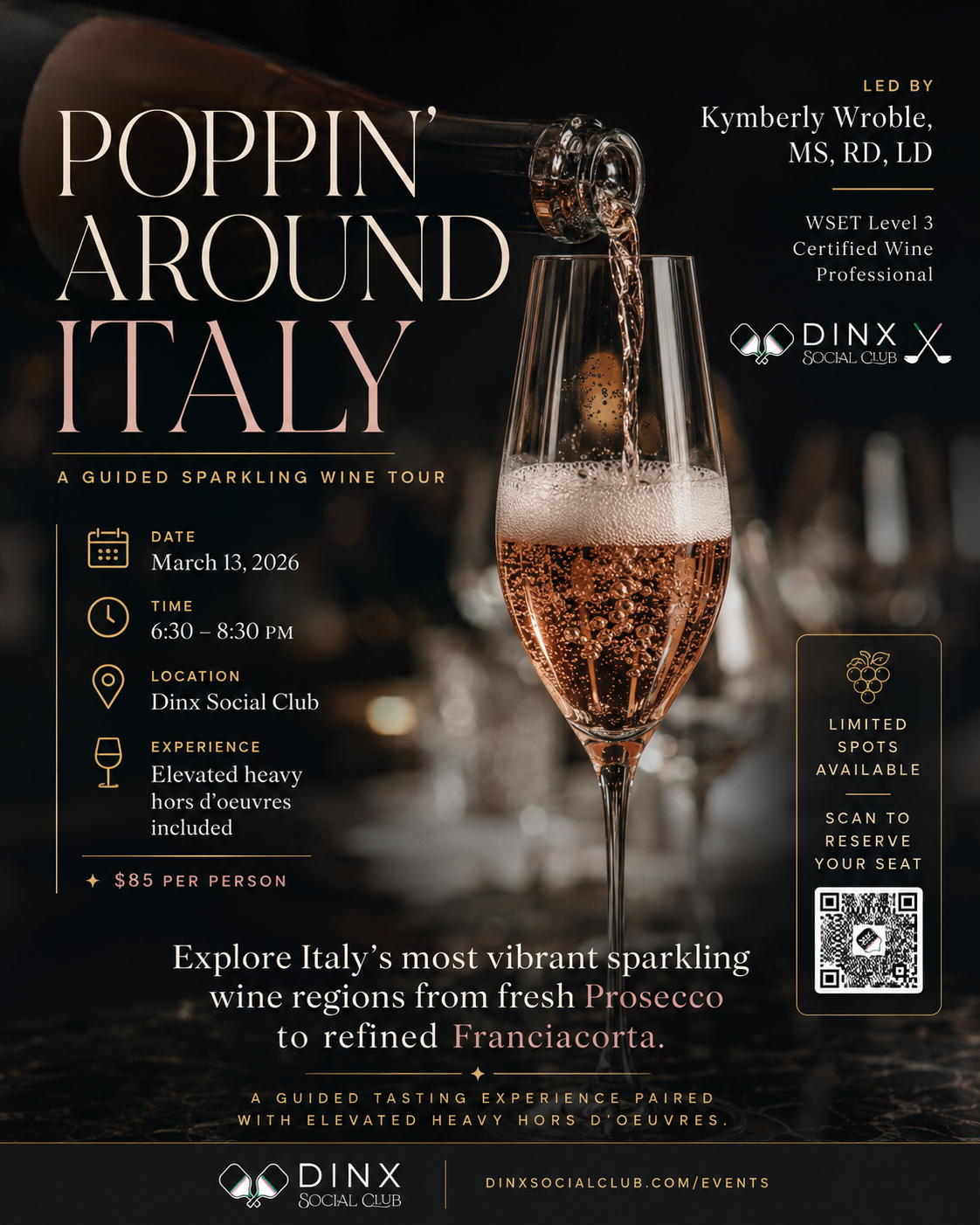
AfterRedesigned
Loading image...
What Improved
- Elegant stacked serif title 'POPPIN' AROUND ITALY'
- Structured left sidebar with icons: DATE, TIME, LOCATION, EXPERIENCE
- Price highlighted with star icon: $85 PER PERSON
- Gold-bordered QR card: 'LIMITED SPOTS AVAILABLE' + 'SCAN TO RESERVE YOUR SEAT'
- Wine regions highlighted in gold (Prosecco, Franciacorta)
- Clean footer with DINX branding and website
- •Original had scattered text with no clear reading flow
- •Icon sidebar creates scannable event details
- •Gold accents elevate the premium wine experience feel
- •Dedicated QR card with urgency messaging drives conversions
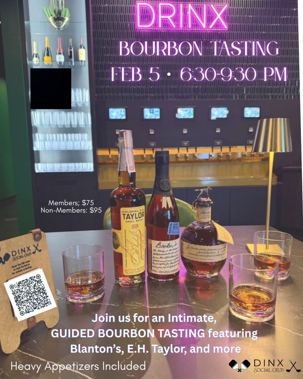
BeforeOriginal
Loading image...
AfterRedesigned
Loading image...

What Improved
- Elegant serif typography for 'BOURBON TASTING' title
- Gold fleur-de-lis accent and separator lines
- Circular pricing badge: Members $75 / Non-Members $95
- QR code on wooden board prop with 'SCAN TO REGISTER'
- Featured bourbons highlighted in gold: BLANTON'S, E.H. TAYLOR
- 'HEAVY APPETIZERS INCLUDED' bar at bottom
- Clean DINX footer branding
- •Original had plain text pricing and cluttered QR placement
- •Circular badge makes tiered pricing instantly clear
- •Gold accents match the premium bourbon experience
- •Wooden board QR prop adds sophistication and visibility
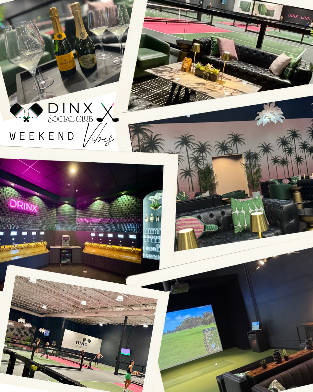
BeforeOriginal
Loading image...
AfterRedesigned
Loading image...
What Improved
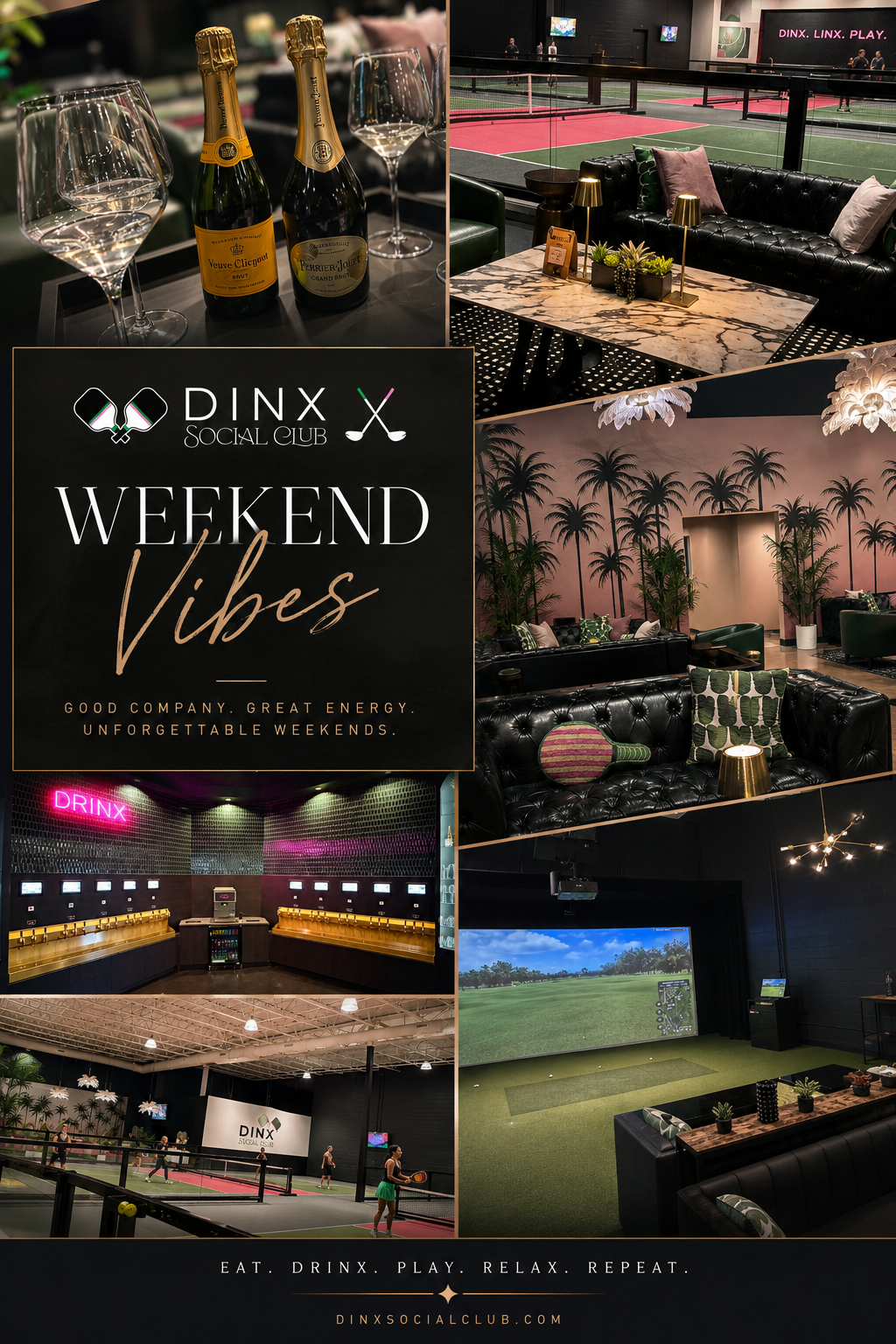
- Organized grid layout vs. scattered polaroids
- Centered dark overlay card with DINX logo and title
- Tagline: 'GOOD COMPANY. GREAT ENERGY. UNFORGETTABLE WEEKENDS.'
- Gold accent lines frame the title elegantly
- Footer: 'EAT. DRINX. PLAY. RELAX. REPEAT.'
- Website URL prominently displayed
- •Original scattered photos lacked cohesion and messaging
- •Centered overlay card creates focal point and brand presence
- •Tagline communicates the DINX vibe and experience
- •Clean footer with website drives traffic
BeforeOriginal
Loading image...
AfterRedesigned
Loading image...
What Improved
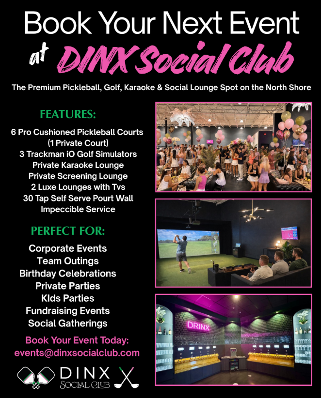
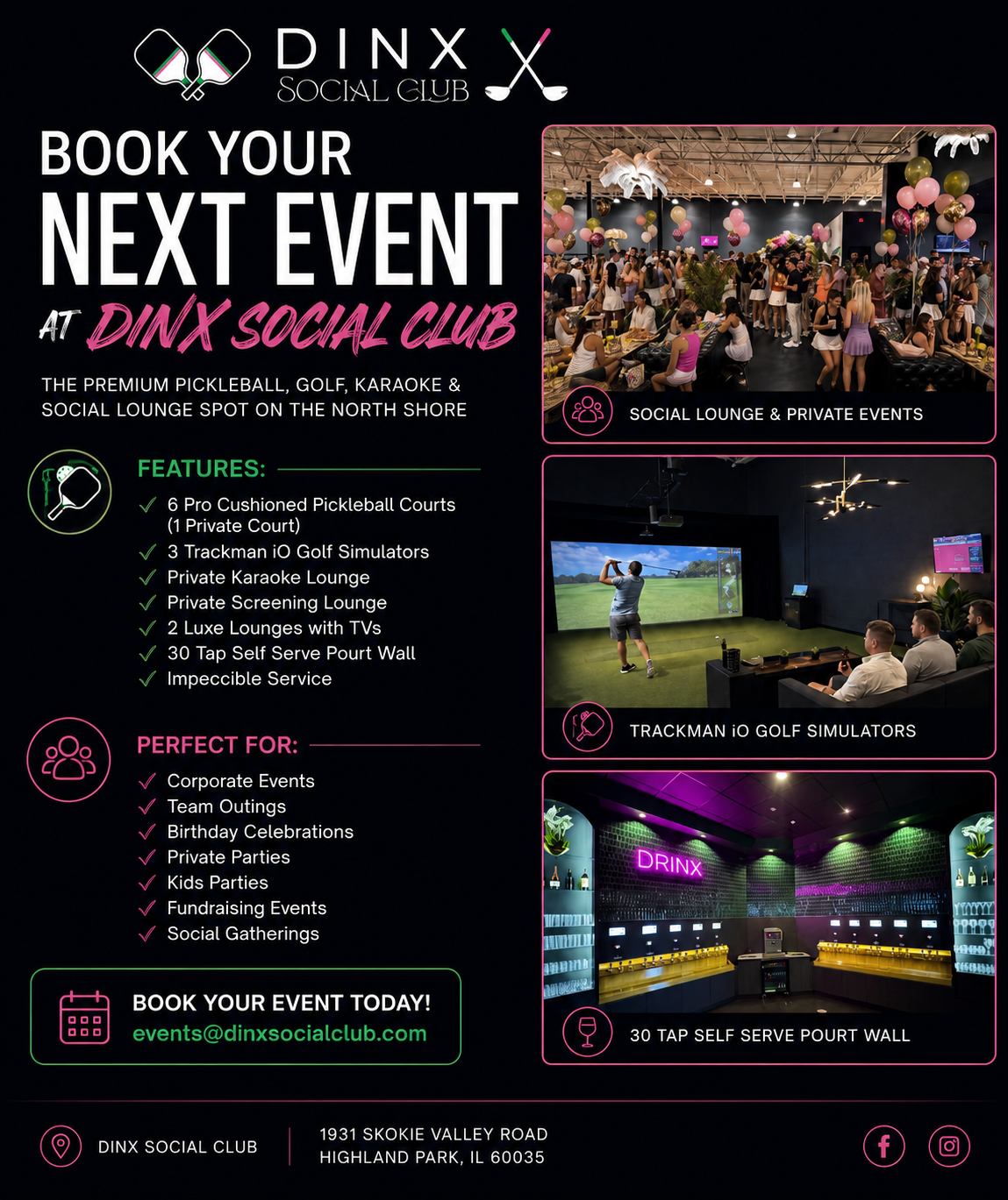
- Added DINX logo branding at top for brand recognition
- Custom icons for each section (paddle, people, QR code)
- Green checkmarks for scannable feature lists
- Photo captions identify each venue highlight
- Proper CTA card with booking contact info
- Footer with address and social media links
- •Original had no visual hierarchy - all text looked the same weight
- •New design guides the eye: Logo → Headline → Features → Photos → CTA
- •Icons and checkmarks make features scannable in seconds
BeforeOriginal
Loading image...
AfterRedesigned
Loading image...
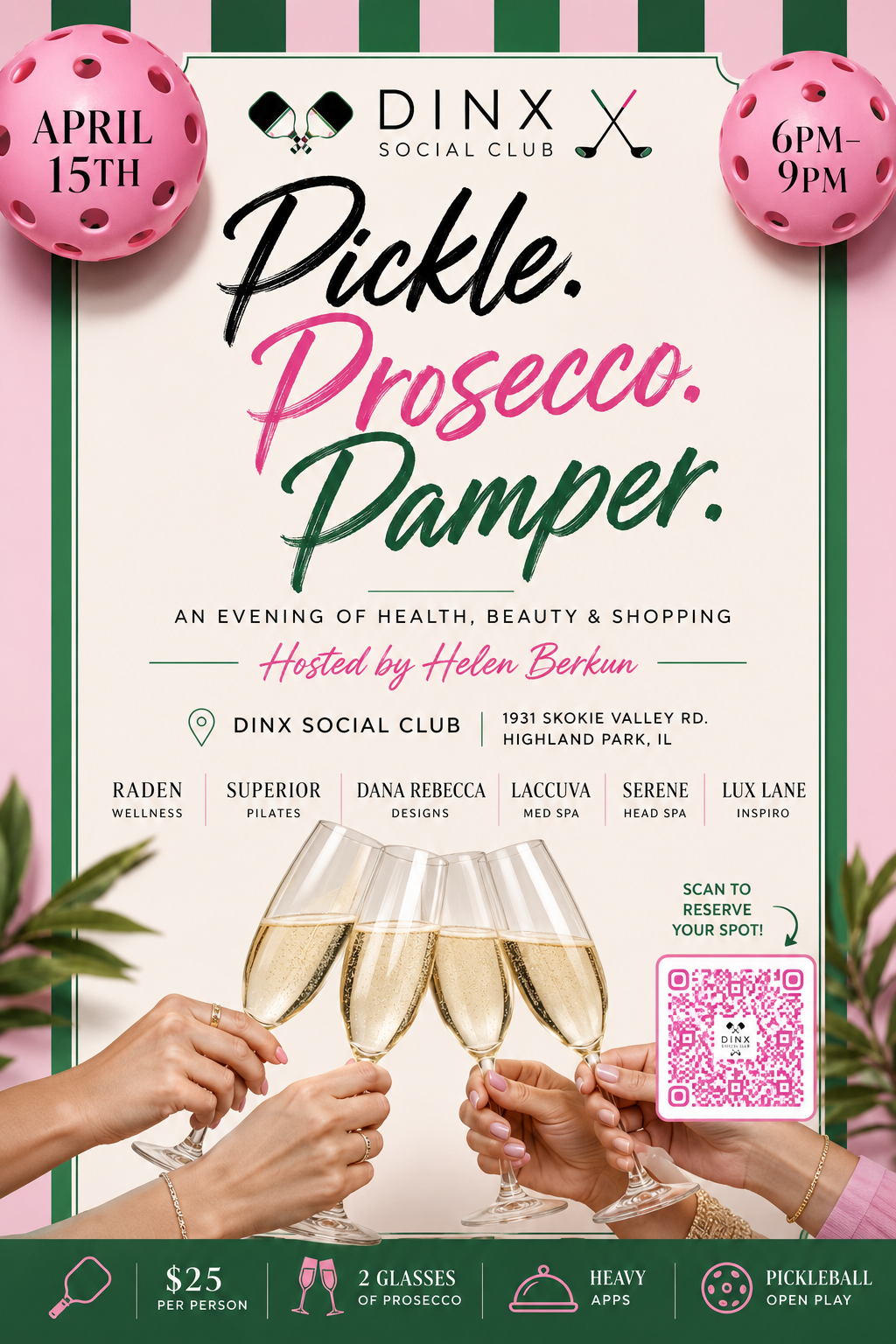
What Improved
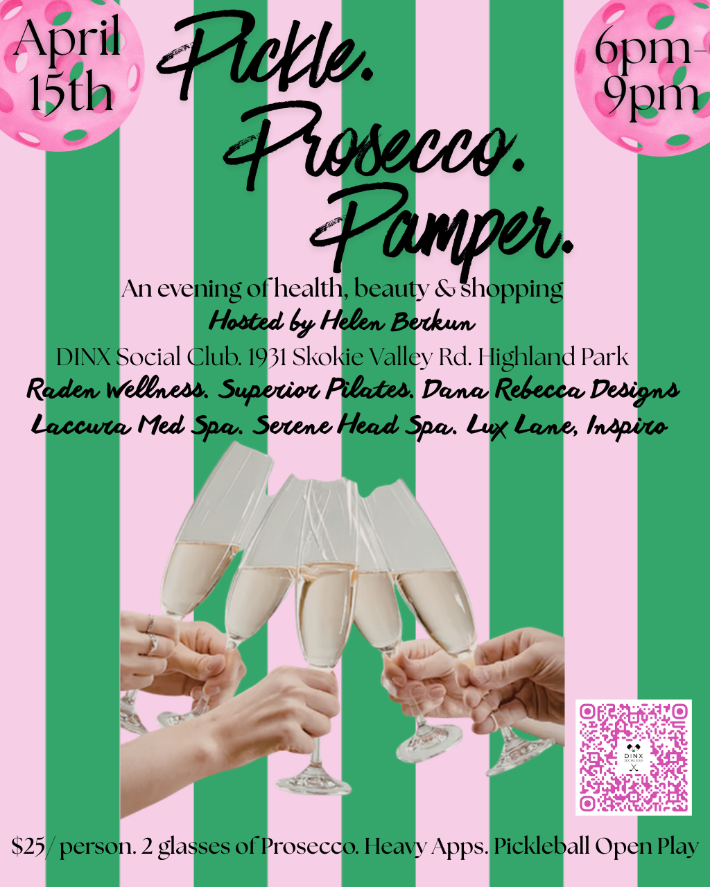
- Stripes contained in decorative border with cream center panel
- DINX logo prominently placed at top center
- Date and time in corner badge treatments
- Vendor names in clean labeled boxes
- QR code with 'Scan to reserve your spot!' arrow CTA
- Structured footer bar with icons for what's included
- •Original full-bleed stripes made text hard to read
- •Cream center panel creates contrast for readability
- •Icon footer communicates value instantly
BeforeOriginal
Loading image...
AfterRedesigned
Loading image...
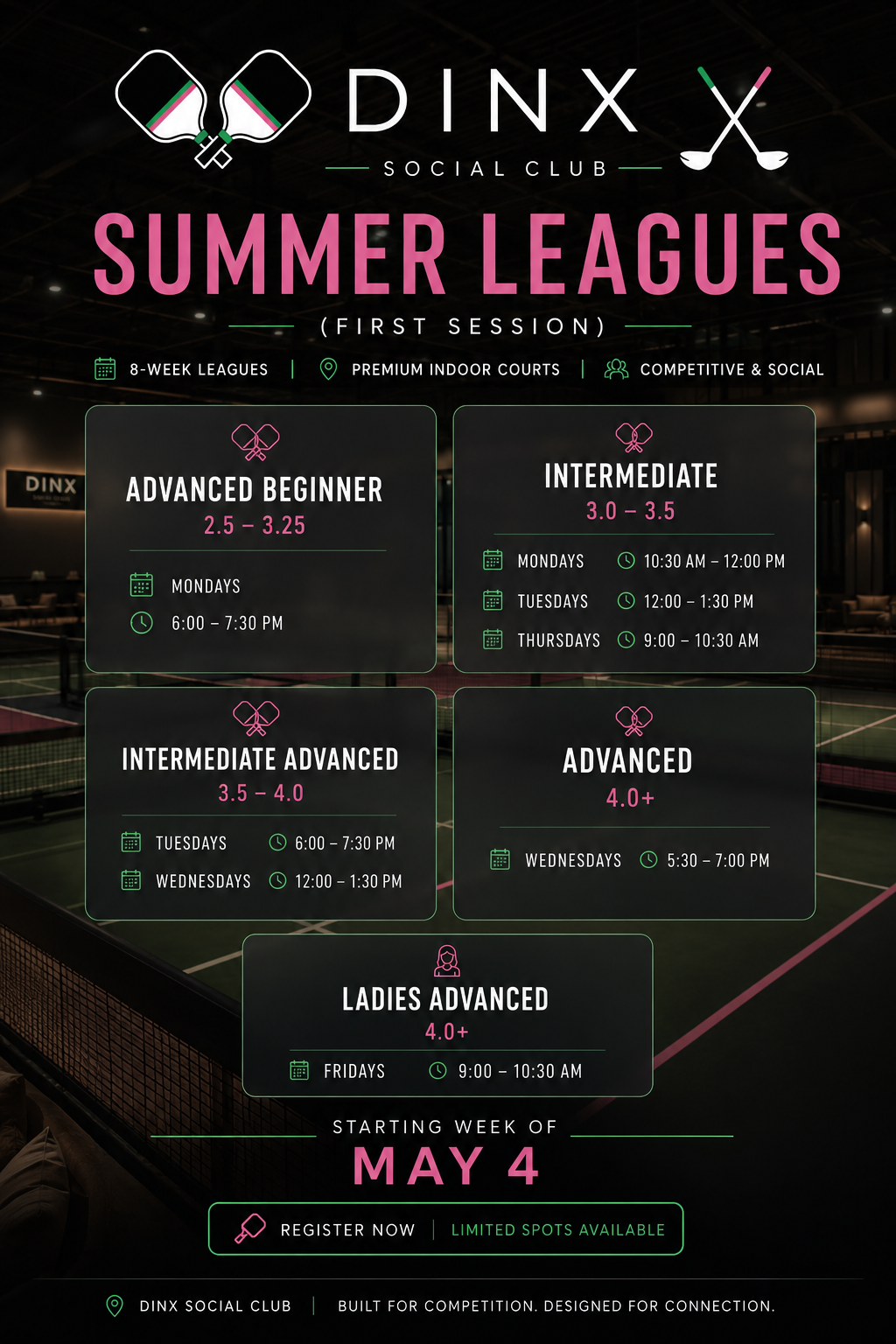
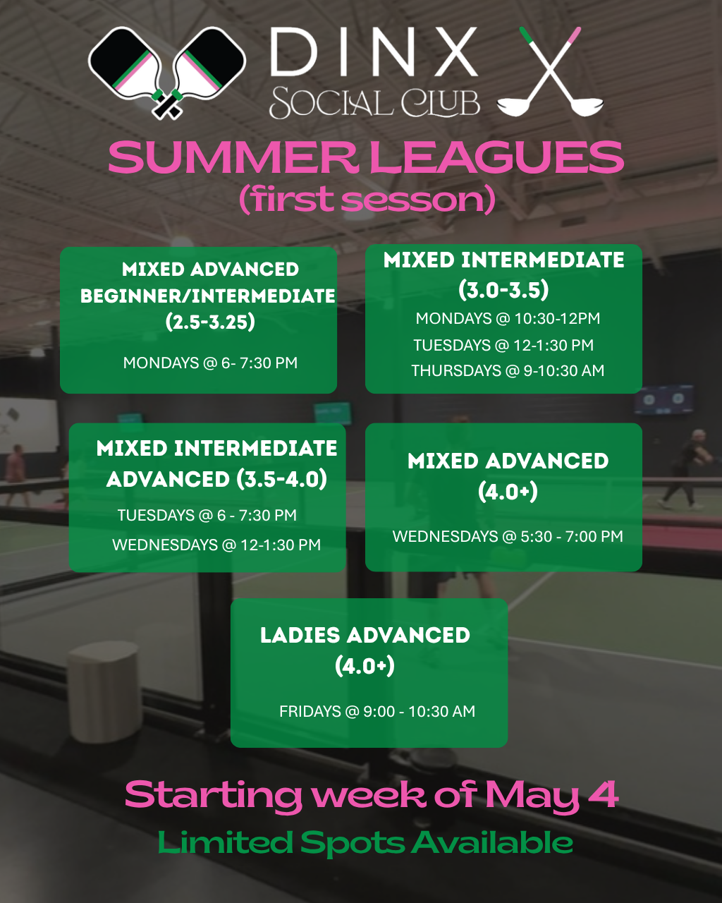
What Improved
- Fixed typo: 'first sesson' → 'FIRST SESSION'
- Added value proposition bar with key benefits
- Paddle icons on each skill level card
- Calendar and clock icons for structured day/time info
- Semi-transparent card backgrounds
- Proper 'REGISTER NOW' CTA button
- •Original had a typo that undermined professionalism
- •Icons make day/time info scannable at a glance
- •Clear CTA button drives registrations
BeforeOriginal
Loading image...

AfterRedesigned
Loading image...
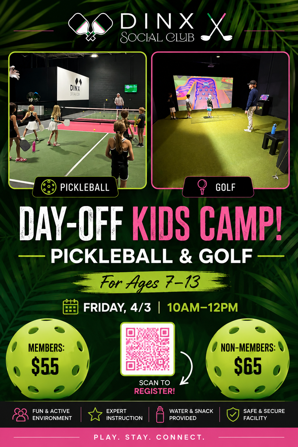
What Improved
- DINX logo prominently placed at top
- Photo frames with colored borders and activity labels
- 'KIDS CAMP!' in pink for visual emphasis
- Calendar icon with structured date/time display
- QR code with 'SCAN TO REGISTER!' CTA arrow
- Benefits bar: Fun Environment, Expert Instruction, Snacks, Safety
- •Original photos had no labels - unclear what activities were shown
- •Benefits bar reassures parents about safety and value
- •Professional look builds parent confidence
BeforeOriginal
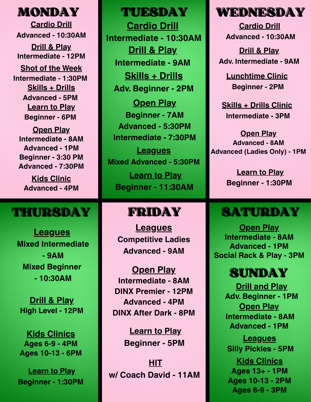
Loading image...
AfterRedesigned
Loading image...
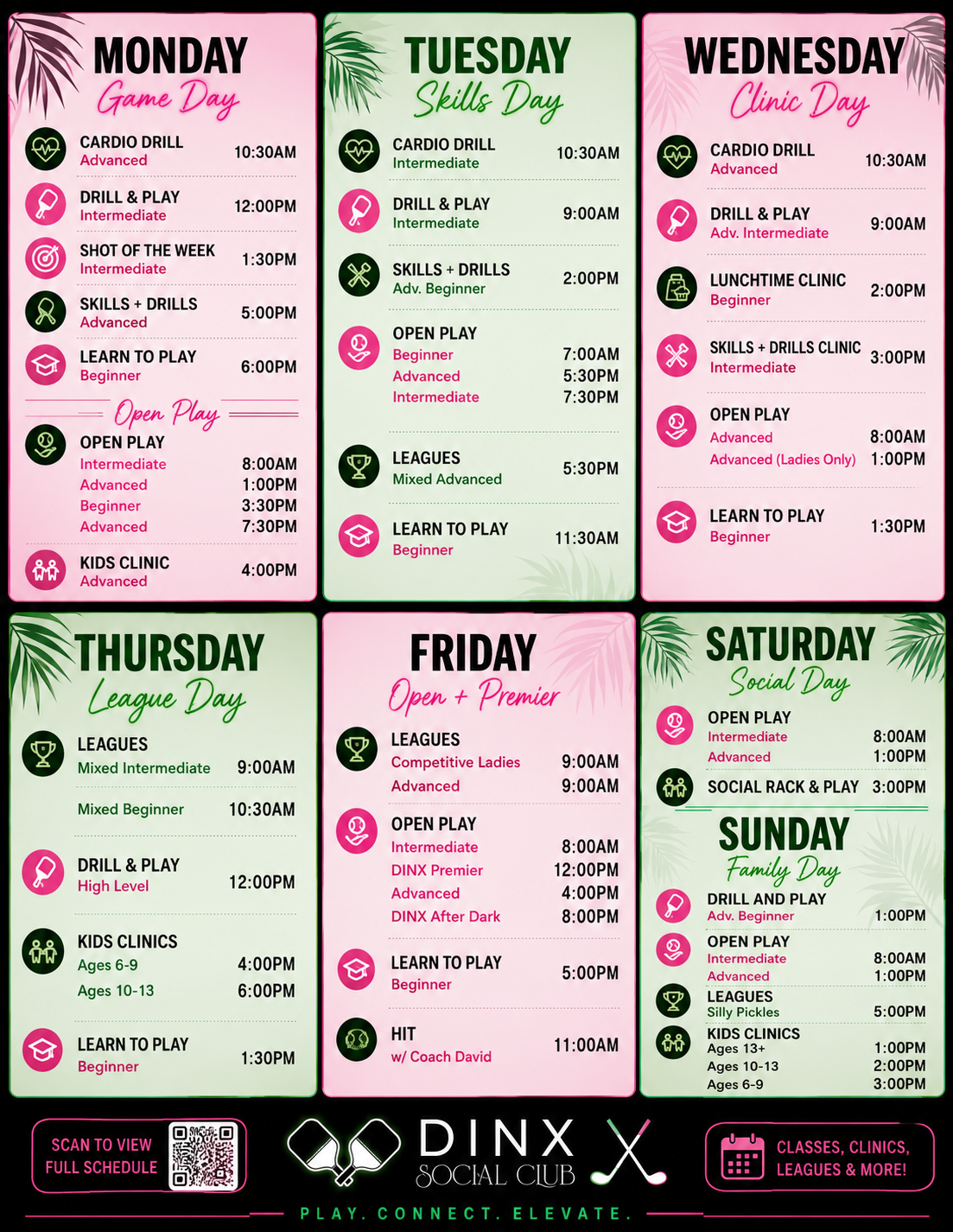
What Improved
- Day themes added (Game Day, Skills Day, Clinic Day, etc.)
- Custom icons for each activity type (cardio, drill, leagues, kids)
- Structured time columns instead of cramped text lists
- Palm leaf decorations for premium feel
- QR code footer with 'SCAN TO VIEW FULL SCHEDULE'
- Tagline: PLAY. CONNECT. ELEVATE.
- •Original 6-panel grid was cluttered and hard to scan
- •Day themes help members quickly find relevant programming
- •Icons make activity types instantly recognizable
- •Structured layout reduces cognitive load when planning visits
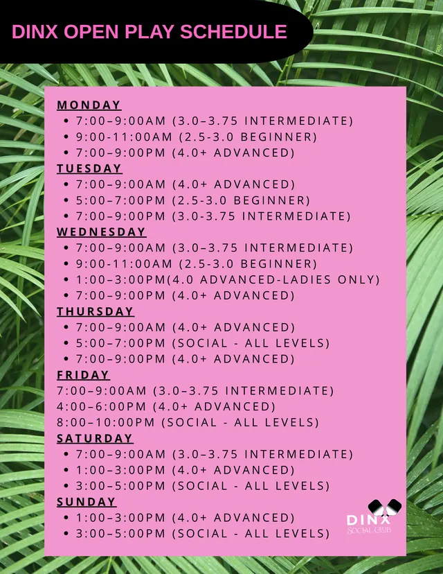
BeforeOriginal
Loading image...
AfterRedesigned
Loading image...
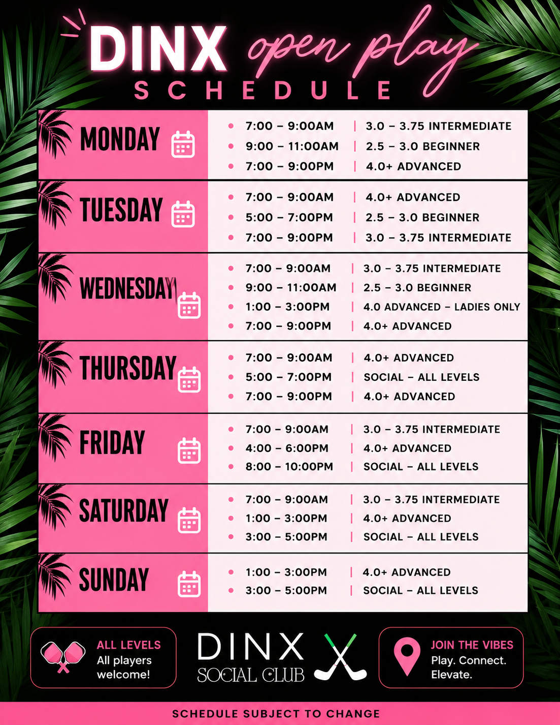
What Improved
- Dark theme with pink accents for premium look
- Clean table format: Time | Skill Level columns
- Calendar icons for each day row
- Palm leaf decorations frame the content
- 'All Levels Welcome' and 'Join the Vibes' badges in footer
- DINX branding with tagline: Play. Connect. Elevate.
- •Original was plain bullet list on solid pink - hard to scan
- •Table format makes times/levels instantly clear
- •Dark theme feels more premium and evening-appropriate
- •Footer badges communicate inclusivity and vibe
BeforeOriginal
Loading image...
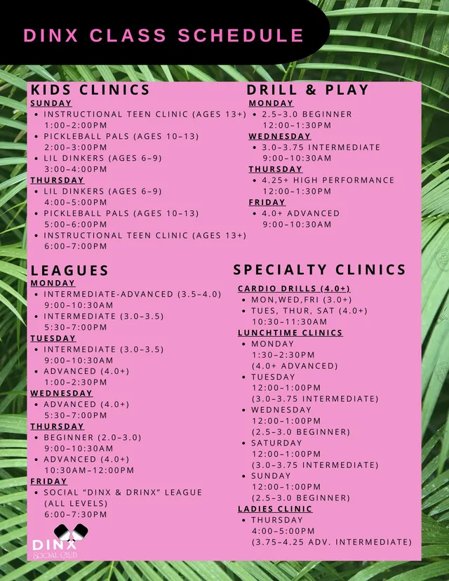
AfterRedesigned
Loading image...
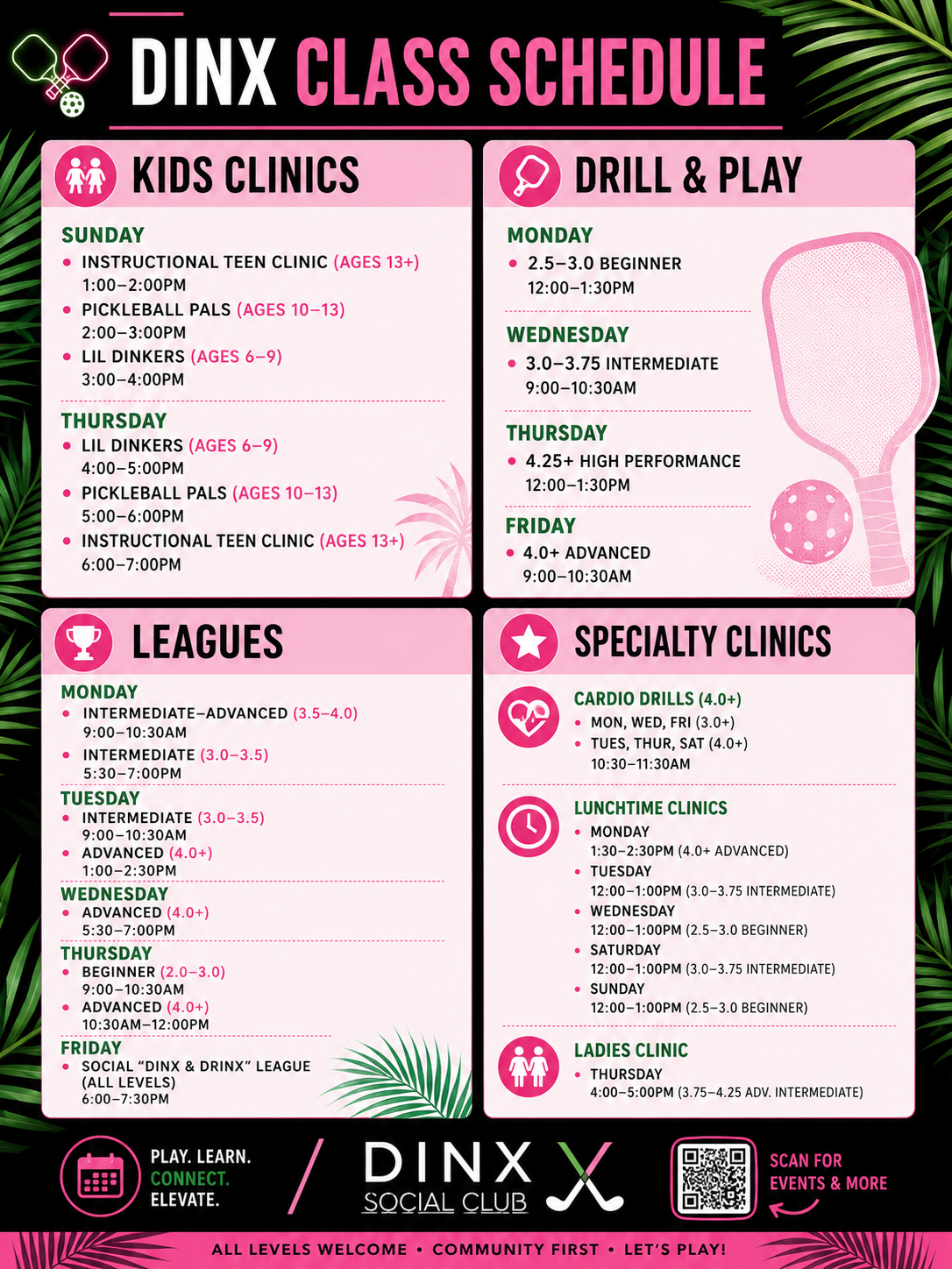
What Improved
- Dark header with palm leaves and prominent title
- 4 clean pink card sections with category icons (kids, paddle, trophy, star)
- Sub-category icons (cardio heart, clock, ladies icon) within Specialty Clinics
- Paddle decoration adds visual interest to Drill & Play section
- Palm leaf accents frame content elegantly
- QR code footer: 'SCAN FOR EVENTS & MORE'
- Taglines: 'PLAY. LEARN. CONNECT. ELEVATE.' and 'ALL LEVELS WELCOME'
- •Original was cramped bullet lists with no visual separation
- •Section icons make categories instantly identifiable
- •Pink card backgrounds create clear visual hierarchy
- •Footer with QR code and taglines drives engagement and communicates values